01 — Overview
Redesigning IATA Agent Experience for web and mobile
- Role
- Web Designer — UX/UI responsibilities
- Company
- Helix Global Solutions
- Client
- IATA
- Platform
- Responsive web · Mobile app
- Scope
- Website redesign · New mobile app
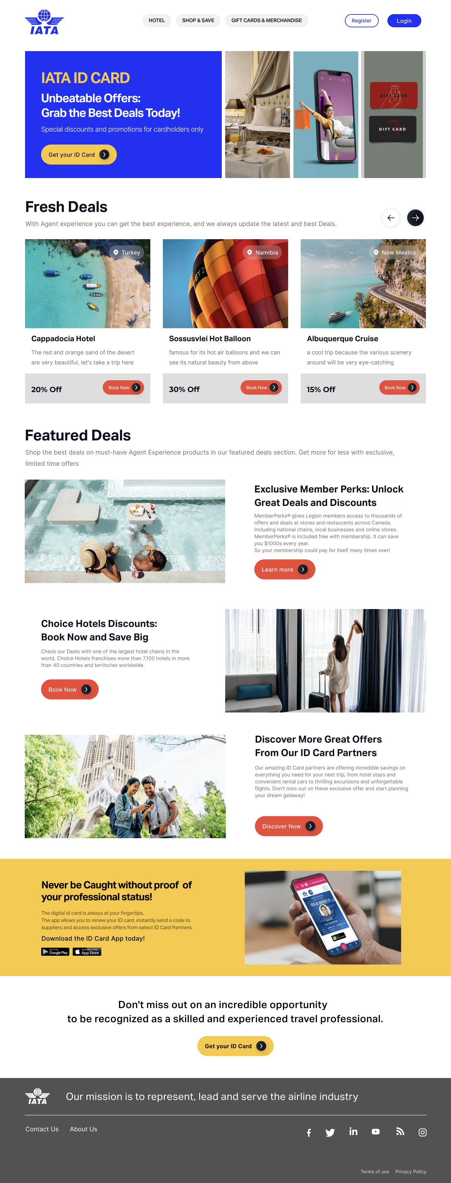
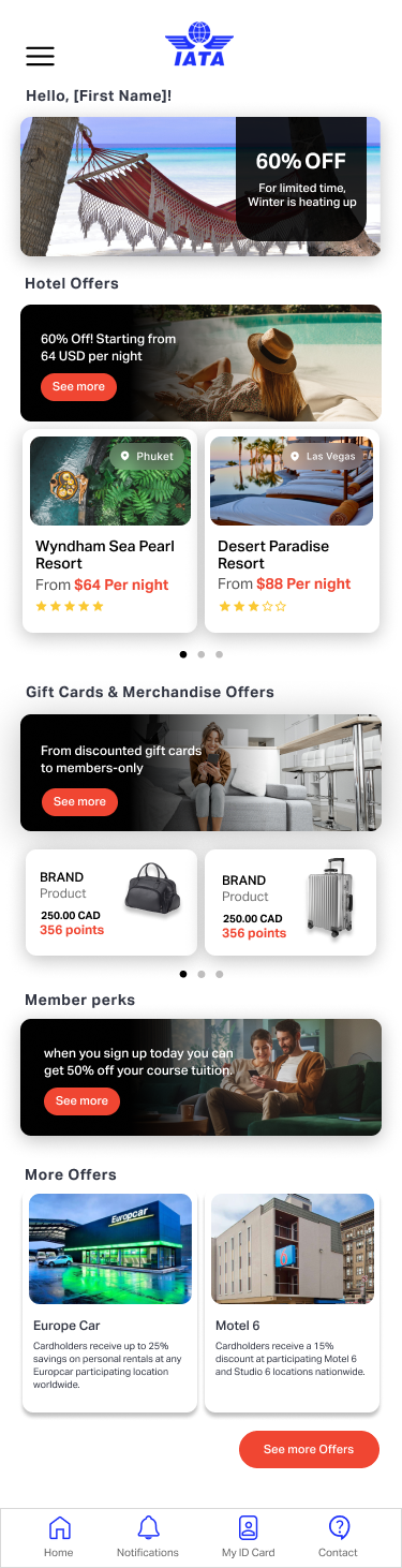
What I worked on
I worked across the website redesign and the new mobile app, from organizing content and user flows to wireframes, prototypes and final UI.
Website redesign · Information architecture · User flows · Wireframes · Prototyping · UI design
I worked with IATA’s existing design system and brand guidelines throughout the project.
02 — Challenge
The website needed more structure — and mobile was starting from zero
The existing Agent Experience was a single-page website with a long continuous scroll. The web experience needed clearer organization and hierarchy, while the mobile app had to be designed from scratch.
Existing website
One page → One continuous scroll → No mobile counterpart
- Restructure the website
- Make content easier to browse
- Design the mobile experience
- Stay consistent with IATA’s brand and design system
03 — Web + Mobile
Two starting points, two design processes
For web, I started with an existing experience and reorganized the content and hierarchy. For mobile, I started from a blank canvas — defining the structure, flows and interface.
Web
Existing website
Content structure
Hierarchy
Responsive UI
Mobile
New product
Information architecture
User flows
Wireframes
Prototype
UI
04 — Designed Experience
How the experience came together
Making benefits easier to browse
01The home feed brings offers, hotel deals, gift cards, merchandise and member perks into clear sections, with the main navigation always available.
Giving key tasks their own space
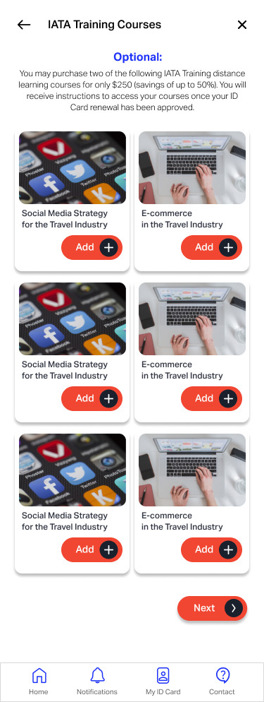
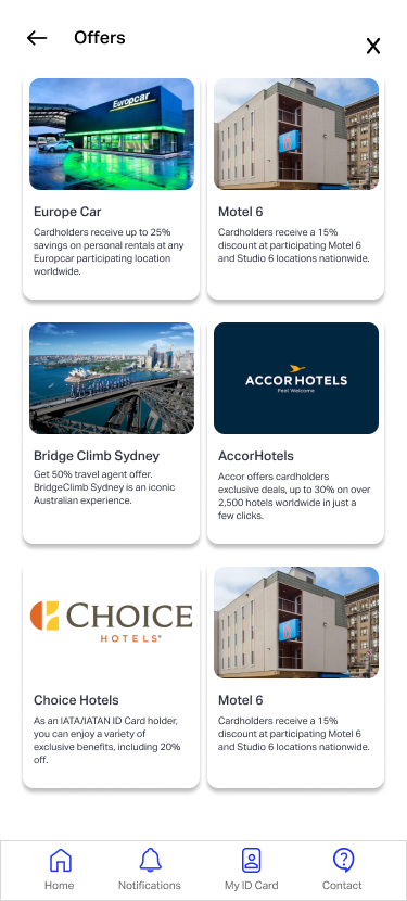
02Training and partner offers have dedicated screens instead of competing with everything on the home feed.
Keeping the digital ID close at hand
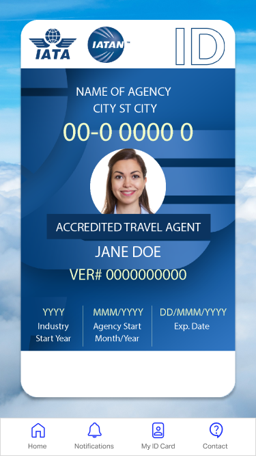
03The mobile app gives agents quick access to their digital IATA ID card alongside the rest of their account tools.
Website redesign
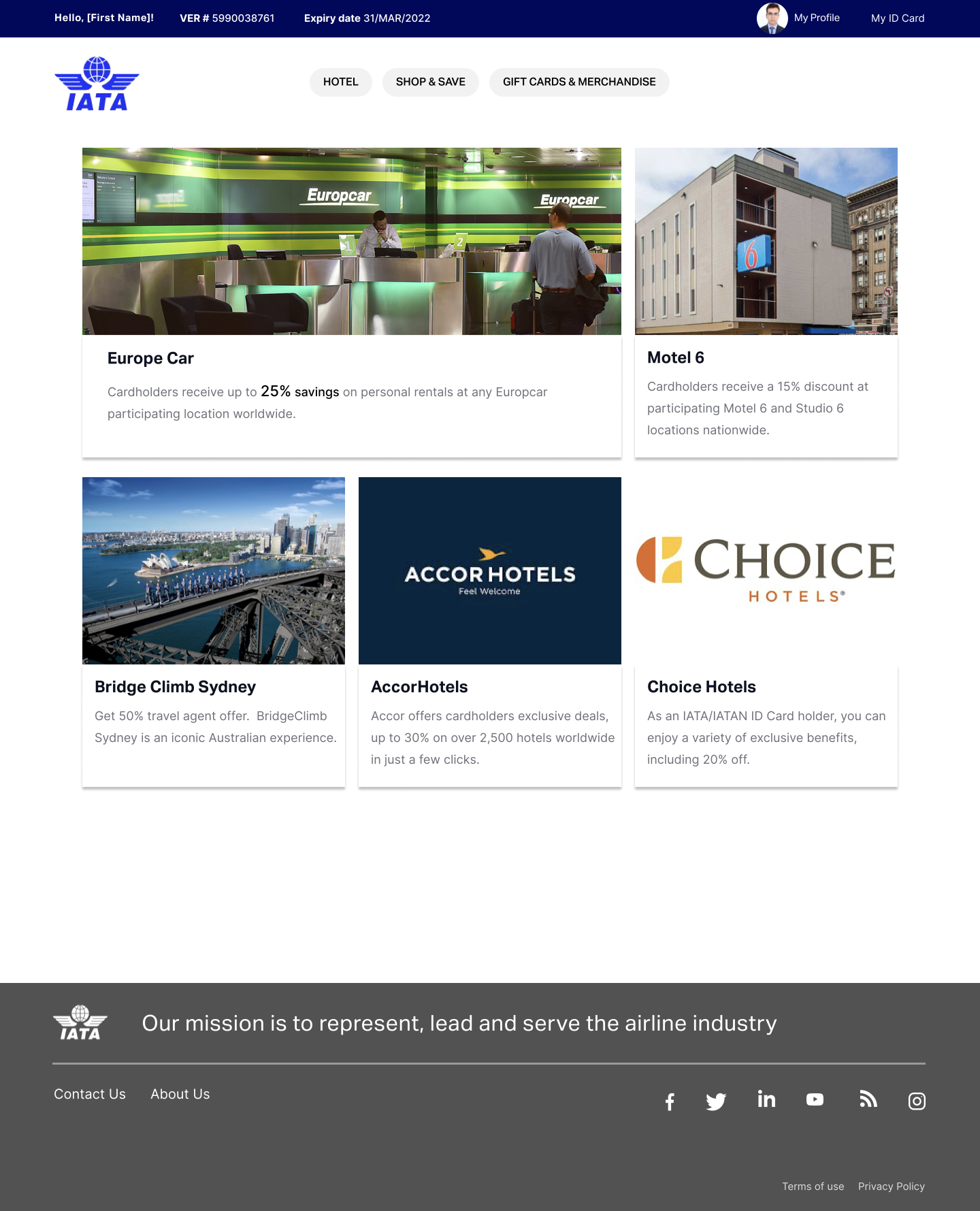
Giving the website a clearer structure
I reorganized the existing one-page experience into clearer sections, making deals, benefits and partner offers easier to browse.
05 — Collaboration + Reflection
Working with IATA and the Helix team
IATA Stakeholders
- Requirements
- Brand guidelines
- Feedback
UX/UI Design — My Role
- Information architecture
- User flows
- Wireframes
- UI design
- Prototyping
Helix Team + Developers
- Collaboration
- Technical implementation
I worked from IATA’s requirements and design system, turning them into web and mobile designs and working with the Helix team and developers through implementation.
Direct customer usability testing was not part of my scope.
What I learned
Working across web and mobile on the same project made me think beyond individual screens. I had to decide what should stay consistent across both platforms and what needed to change for each one.
What I’d do differently
If I had the opportunity to take the project further, I’d test the information structure and key mobile flows directly with agents before development.