E-commerceRewardsResponsive web
Transforming a rewards catalogue into an e-commerce shopping experience
Redesigning ATB My Rewards and ATB Business Rewards—from finding a reward to redeeming points and completing an order.
- Role
- Web Designer — UX/UI responsibilities
- Company
- Helix Global Solutions
- Client
- ATB
- Platform
- Responsive Web
- Status
- Launched November 2023
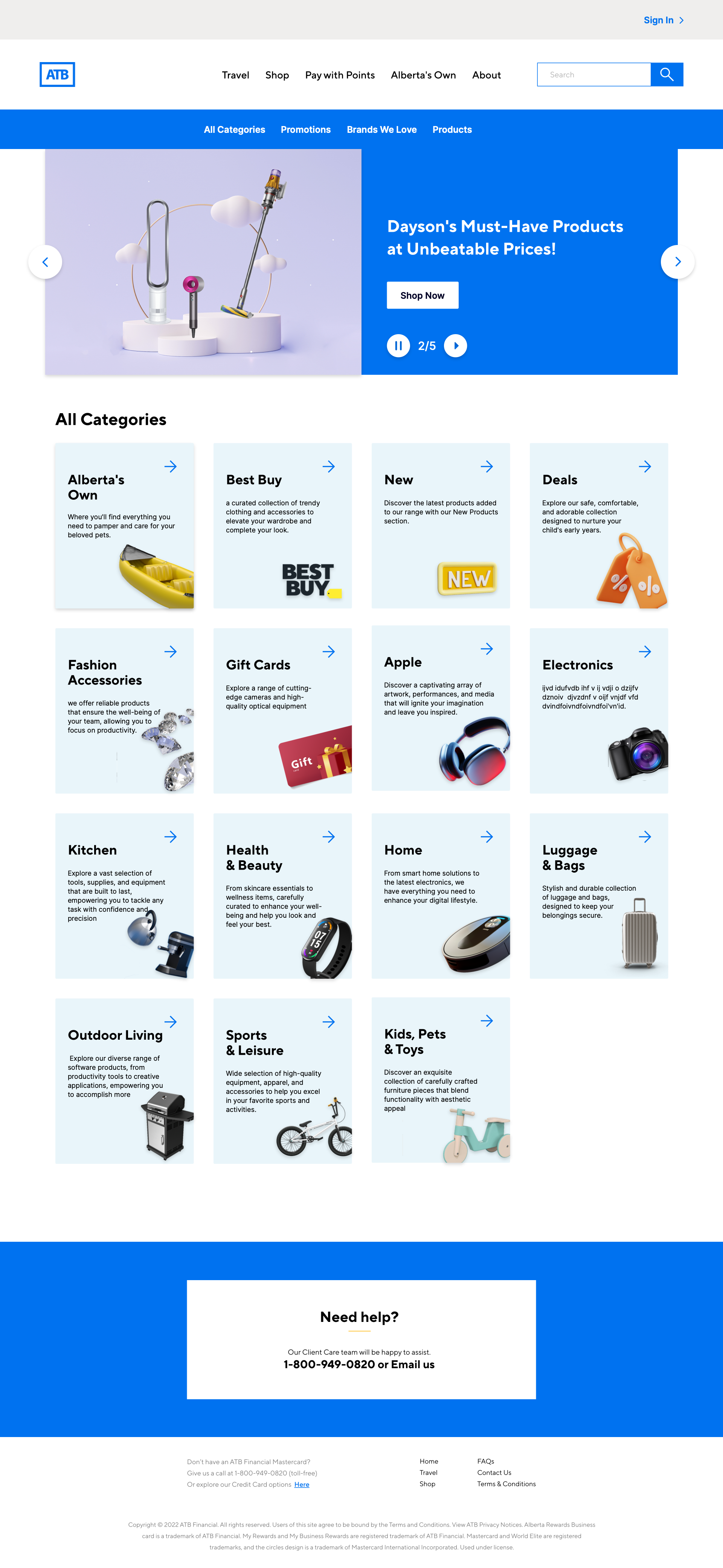
ATB Rewards — Redesigned shopping experience
Responsibilities
UX/UI Design · Information Architecture · User Flows · Prototyping · E-commerce UX · Stakeholder & Developer Collaboration
02 — Challenge + Goals
A rewards platform that didn’t feel like ATB
The existing ATB Rewards experience was based on a standardized rewards-platform structure with limited customization and a relatively flat product catalogue. The redesign aimed to create an experience that felt more connected to ATB while introducing familiar e-commerce patterns for easier product discovery and redemption.
Previous experience
Broad categories → Large catalogue → Browsing & scrolling
- Align the experience with ATB
- Improve product discovery
- Create a scalable e-commerce structure
- Support new partners such as Best Buy
How might we transform a traditional rewards portal into an ATB-branded shopping experience that makes discovering and redeeming rewards easier?
03 — Audience + Product Strategy
One platform, different redemption needs
Customer and card information provided for the project highlighted two primary rewards contexts.
Personal
Everyday products, gifts, family and seasonal shopping.
Business
Higher-value products, premium rewards, travel and experiences.
One platform, different redemption needs.
The core shopping framework remained consistent while available rewards could reflect the customer’s account/card context after login.
Customer segments, card types, geographic market and audience information were provided as project inputs. They were not derived from primary demographic research conducted by me.
04 — Information Architecture + Product Discovery
From a flat catalogue to structured discovery
Before
Shop → Broad Category → Large Catalogue → Scroll
After
Shop
- Categories
- Promotions
- Brands
- Products
Categories → Subcategories
Promotions / Brands → Relevant collections
Product listing → Filter / Search / Sort → Product Detail
Product listing & filters
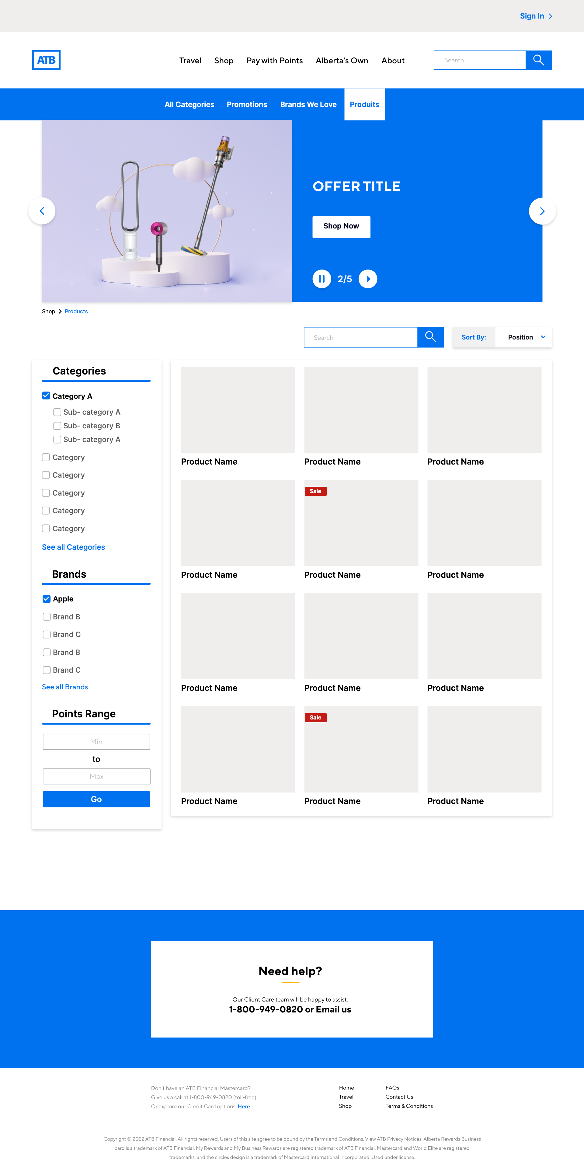
In a rewards experience, customers may shop around the points available to them rather than a traditional dollar budget.
05 — Best Buy + End-to-End Shopping
From a broader catalogue to a complete purchase
Adding Best Buy introduced a much broader product catalogue, requiring a structure that could scale while remaining connected to ATB Rewards.
- Discover
- Filter
- Product
- Redeem
- Checkout
- Confirmation
Best Buy categories
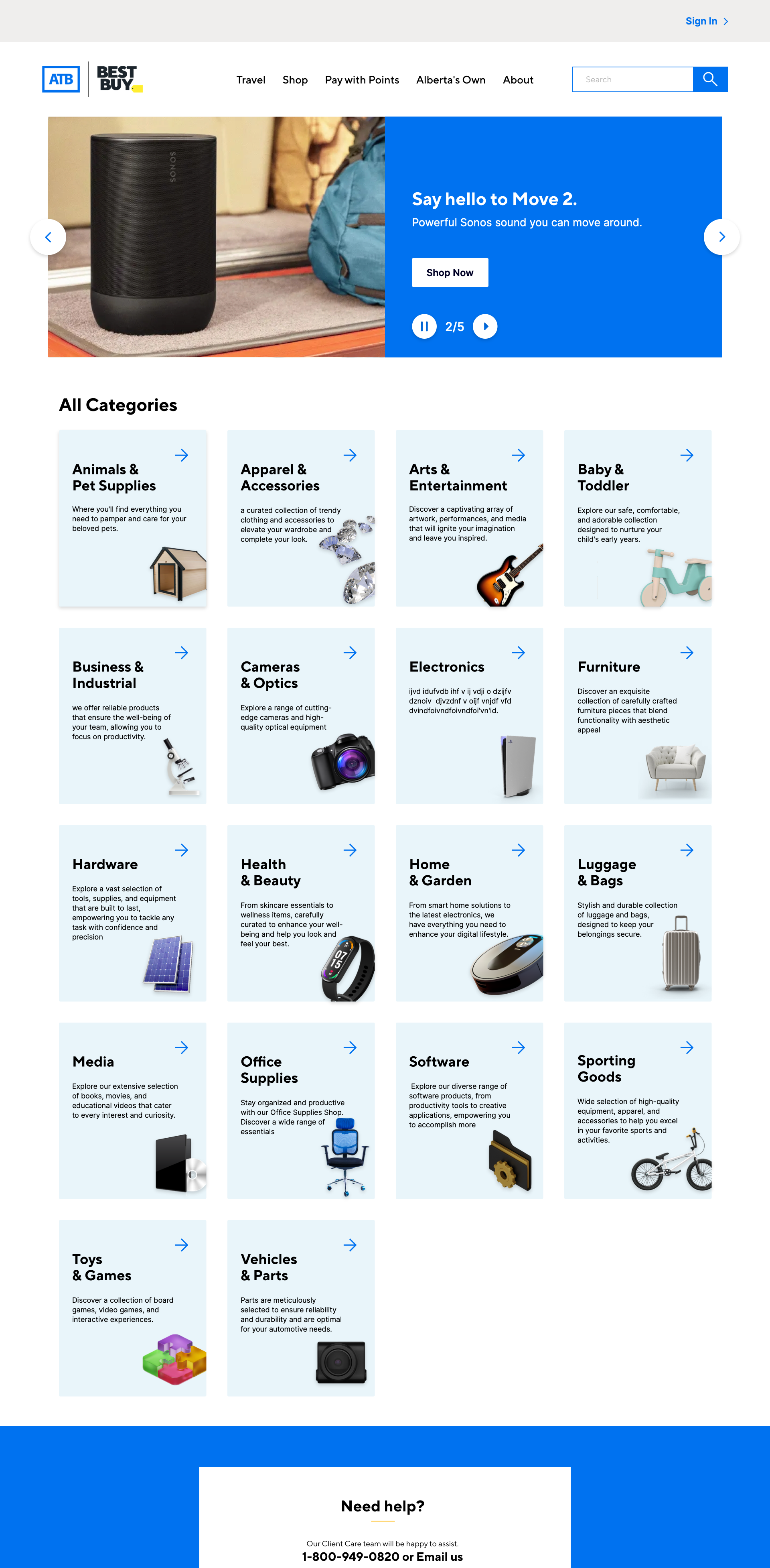
Partner branding could be incorporated while maintaining familiar ATB Rewards navigation and checkout patterns.
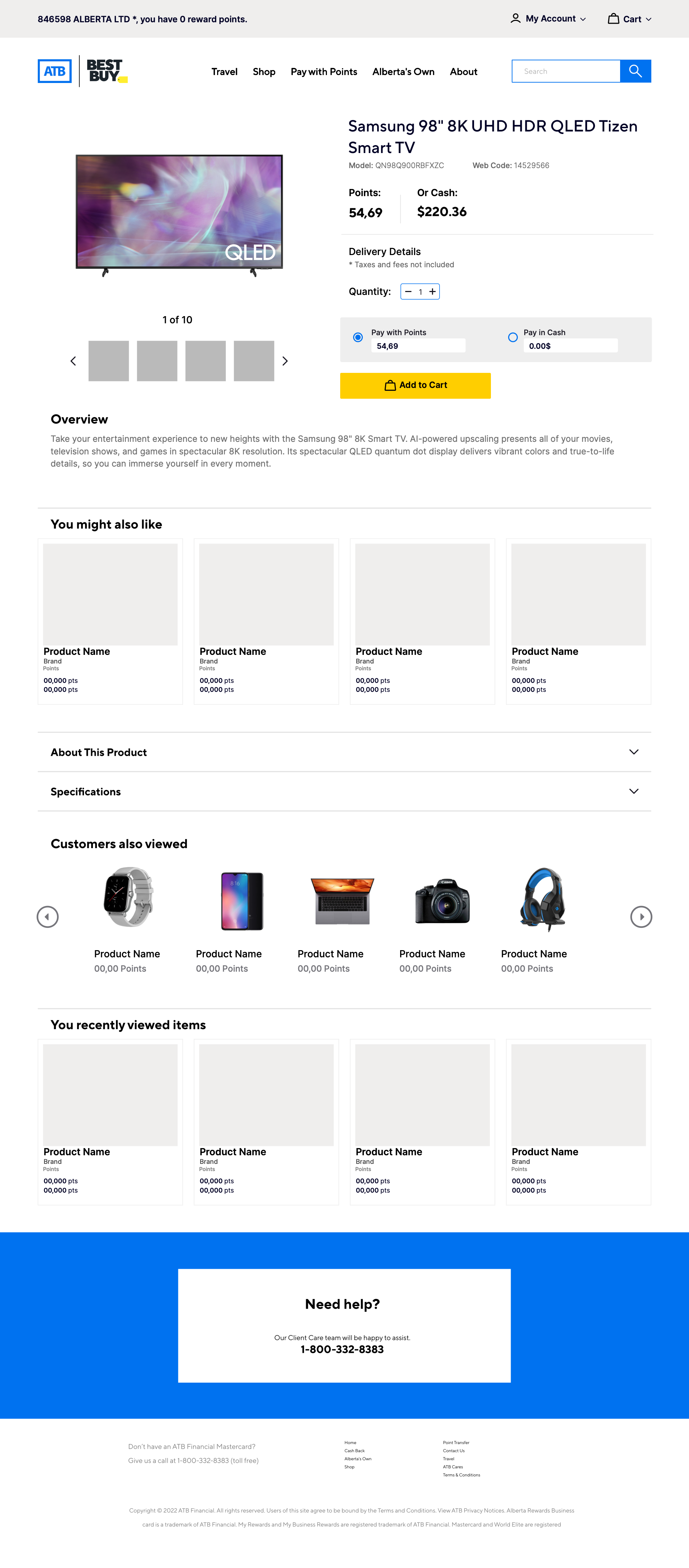
Product detail & redemption
Checkout & order summary
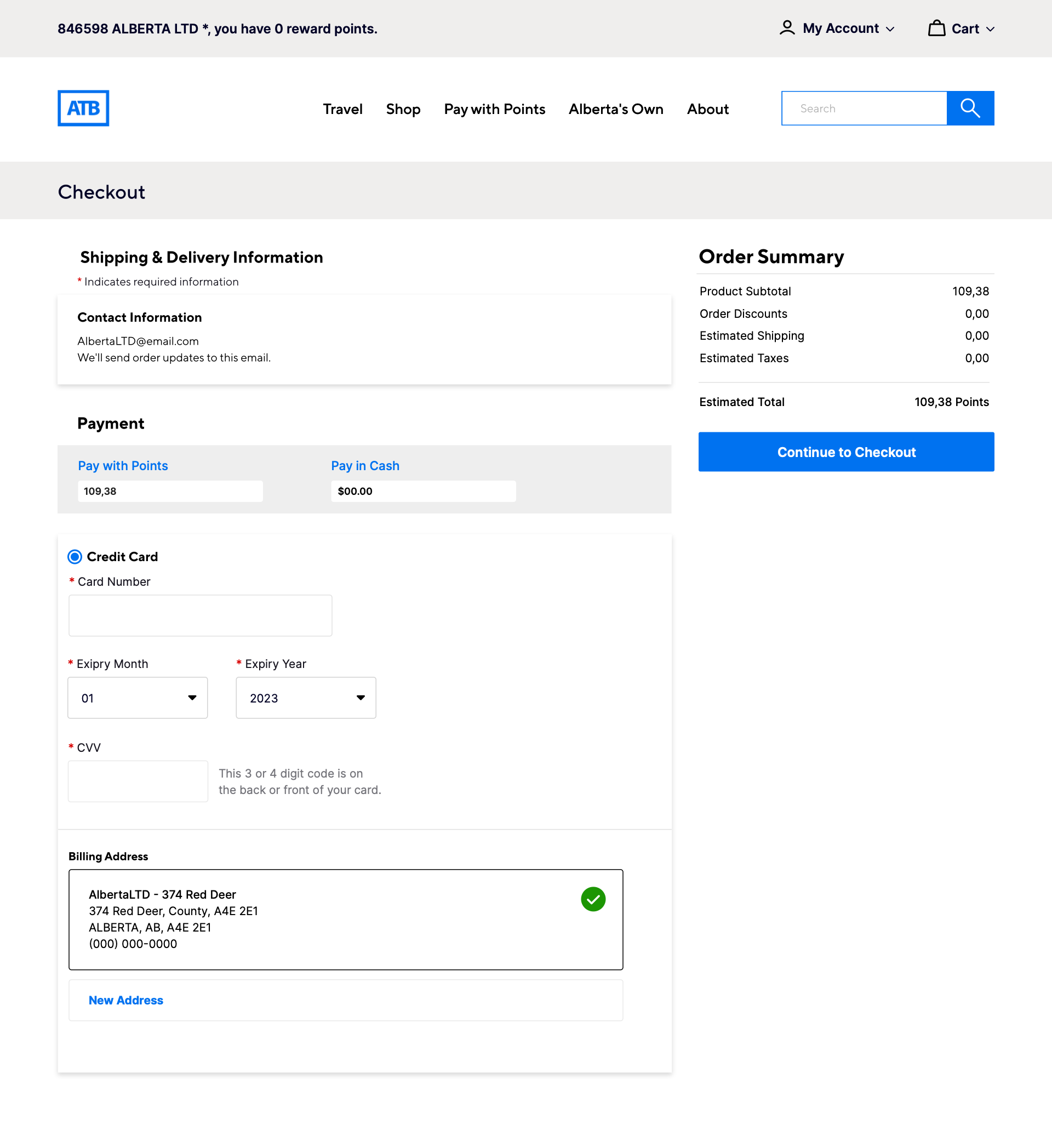
My design contribution was translating the available redemption options into a clear digital experience; the underlying points/cash model was already defined. Confirmation completes the flow; a matching screen is not available in the supplied files.
06 — Collaboration + Launch
From cross-functional review to production
The experience was reviewed iteratively with ATB stakeholders, the Helix team and developers to validate business requirements, brand alignment and technical feasibility.
- Design
- Review
- Refine
- Handoff
- Launch
Direct customer usability testing was not part of my project scope.
Launched
November 2023
ATB My Rewards + ATB Business Rewards
The redesigned ATB Rewards experience moved from UX exploration through stakeholder review, development and production.
Post-launch performance metrics were not available to me. Reaching production is the documented outcome.
07 — Reflection
What I learned
This project strengthened my understanding of designing commerce experiences within an existing platform, where customer needs, business requirements, partner integrations and technical constraints all need to work together.
What I’d do differently
If extending the project today, I would introduce direct customer usability testing earlier, particularly around product discovery, filtering, points-based redemption and checkout.